Charts
The Charts panel lets you visualize the (possibly filtered) data in the Rows panel. In many contexts, the Charts panel will start with a chart-creation widget, which provides guidance about what chart will be created from selected columns.
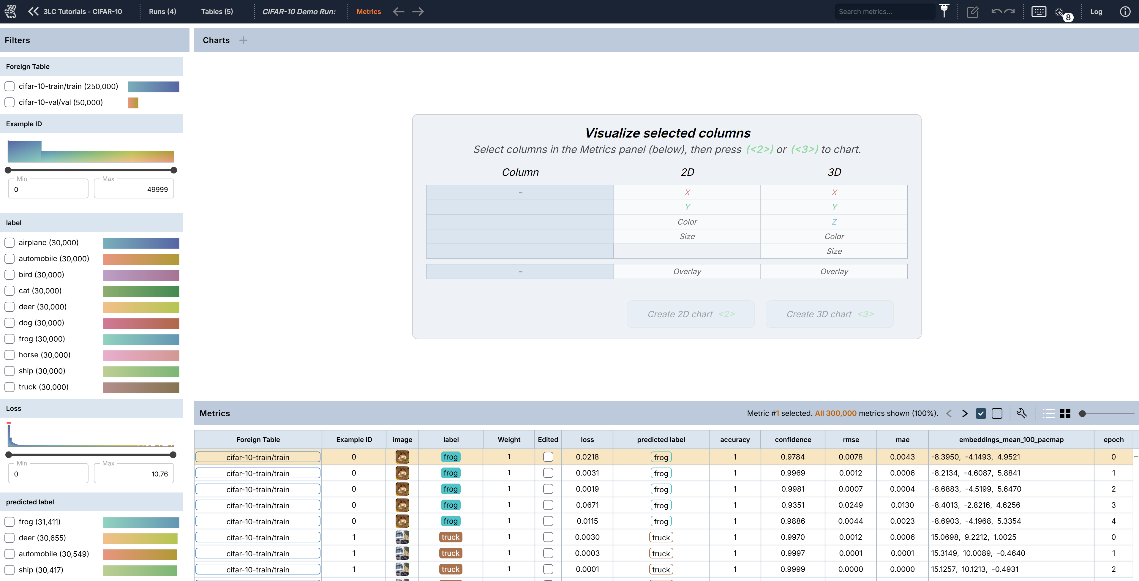
Creating Charts
To create a chart, select one or more columns, which will automatically fill in the chart-creation widget in the order
in which they are selected. Note that the image and BBS columns will be filled in the Overlay row in the widget while
other columns will be filled in rows of X, Y, Color, etc. Click Create 2D chart or Create 3D chart in the widget to
create a chart after desired columns are selected.
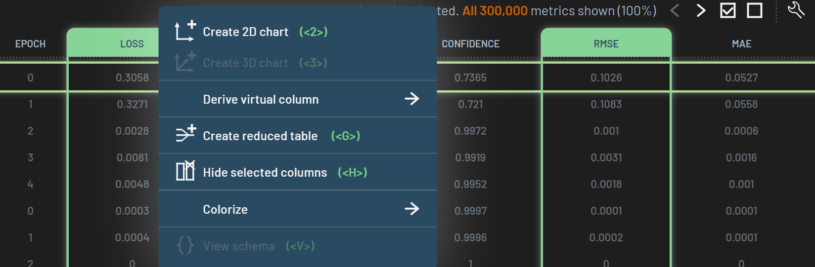
Alternatively, you can select the column(s), RightClick, and select Create 2D chart or Create 3D chart in the context menu.
To create an image chart for a Run or a Table, select the IMAGE column (click the column header),
RightClick on the IMAGE column header, and select Create 2D Chart on the popup
menu. Alternatively, you can press 2 after selecting the IMAGE column.
To create a 2D or 3D scatter plot chart, select the columns that you want to plot, RightClick
on the one of the selected columns, and select Create 2D Chart or Create 3D Chart on the popup menu. Alternatively,
after selecting the columns, press 2 to create a 2D chart or 3 to create a 3D
chart. Note that you can select the “colored by” column along with the plot axis columns, that is, the 2D scatter
plot will be colored by the 3rd column you selected. If no 3rd column selected, the plot will be colored by a default
metric, often by label.
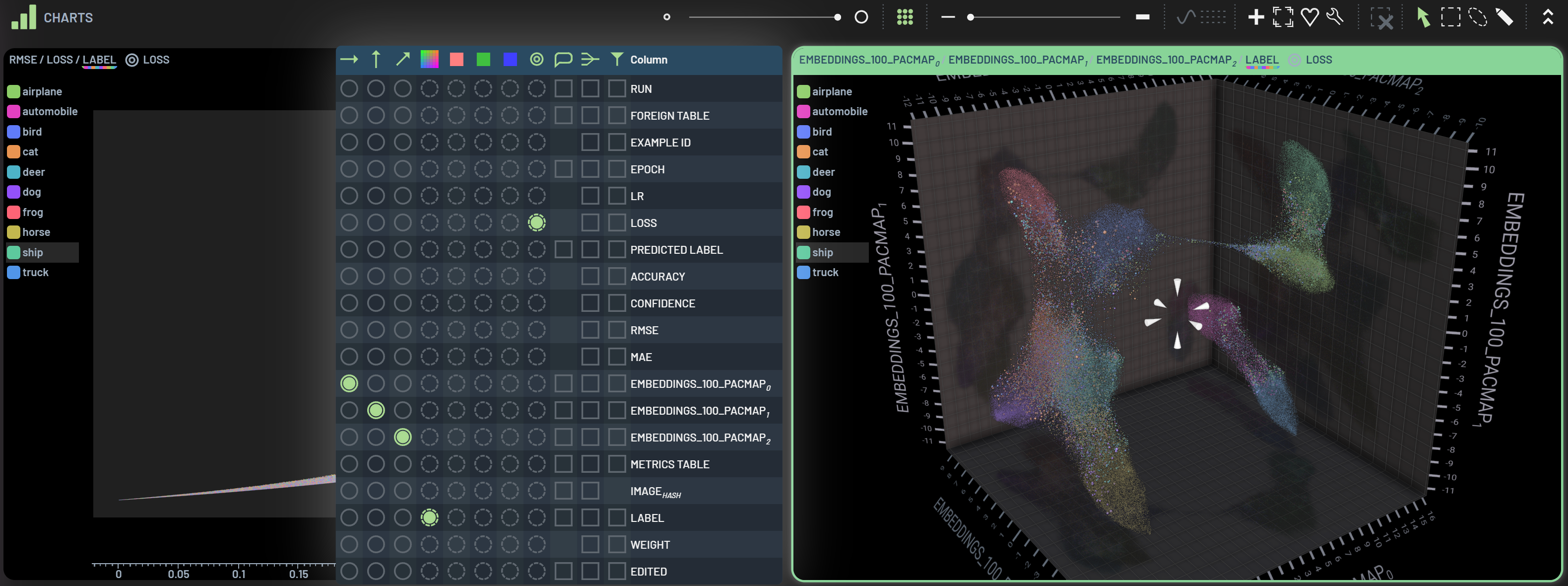
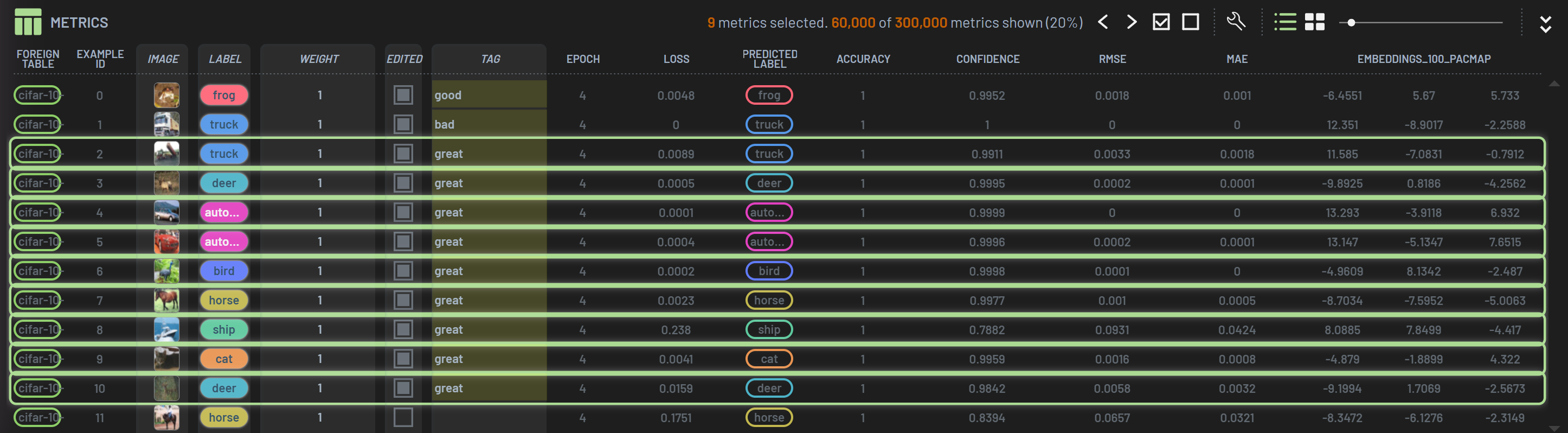
In the example below, an image chart and a 2D scatter plot of RMSE vs LOSS are presented in the Charts panel area. The individual chart title bar shows the column names. For the scatter plot below, RMSE/LOSS/LABEL correspond to X-axis, Y-axis, and Color, respectively. The selected chart, highlighted by the green outline, can be tweaked with the settings in the Charts toolbar, such as the point size slider. See How to tweak a chart for details.
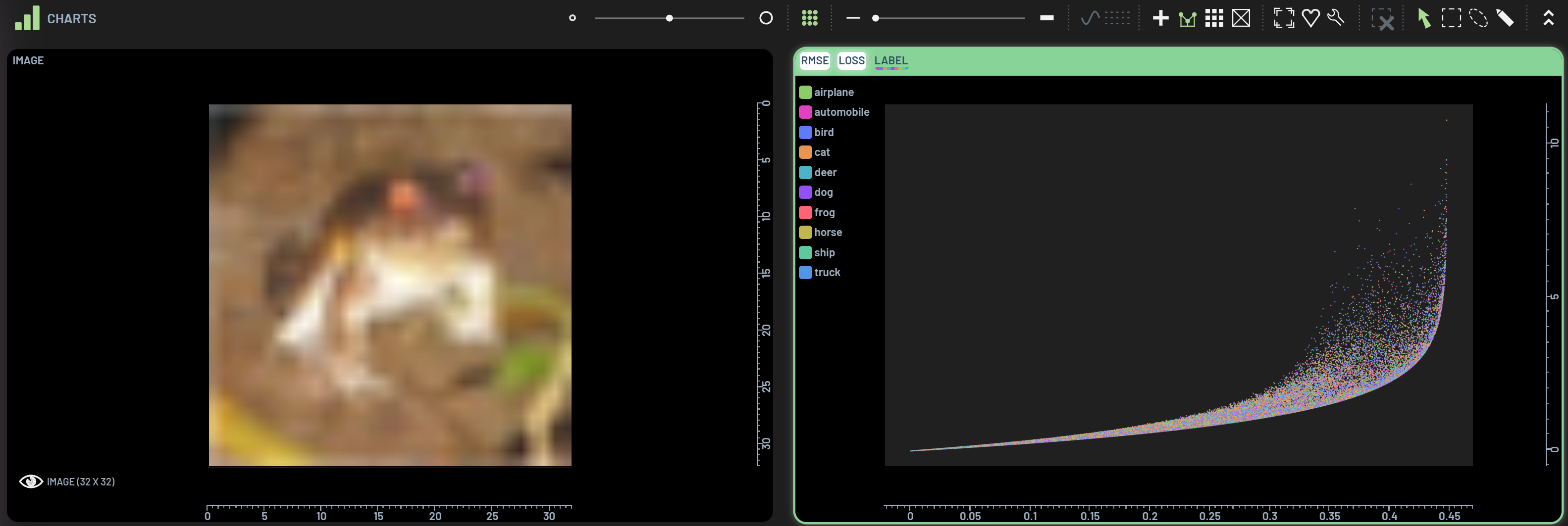
Image chart
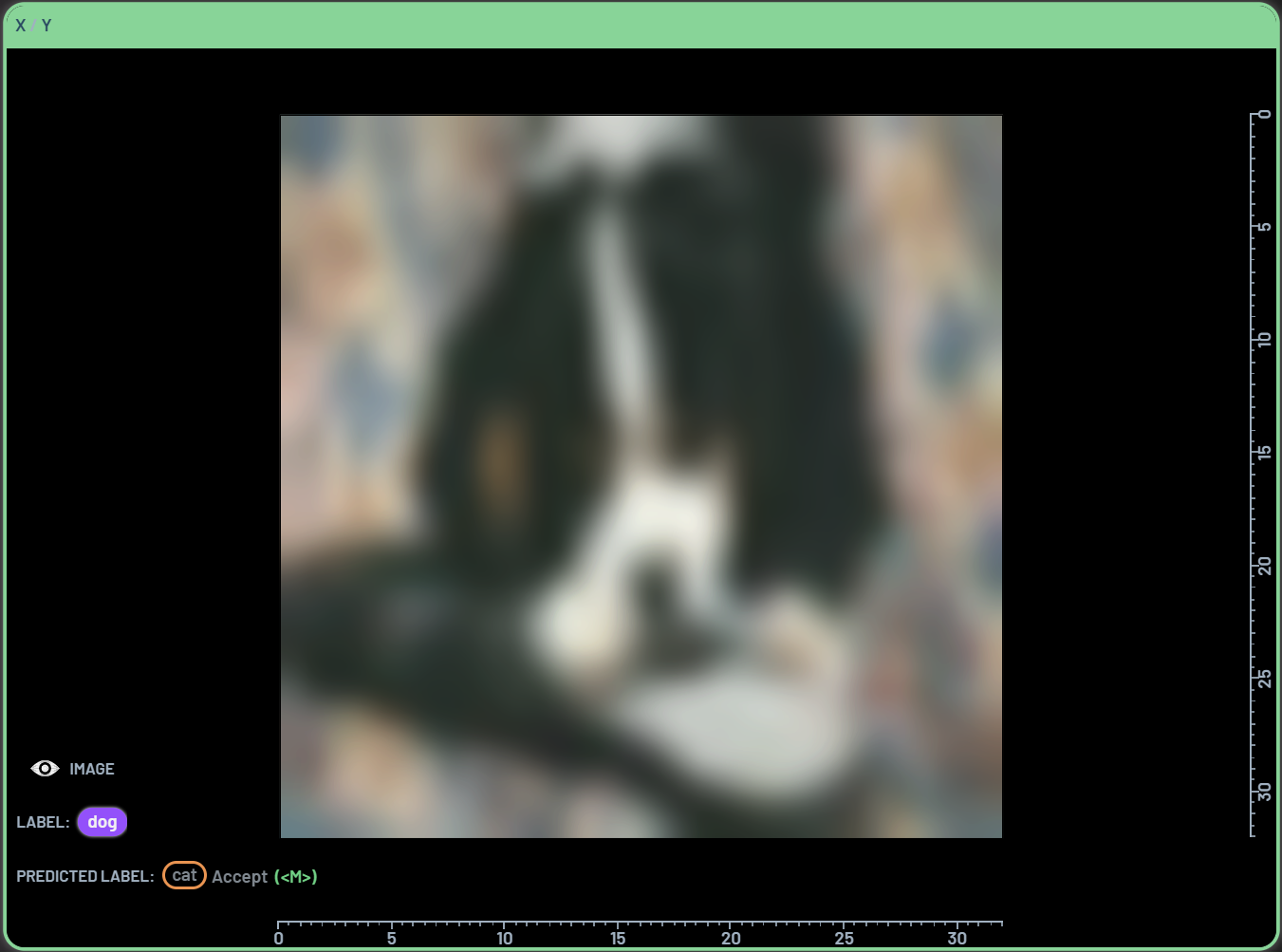
An image chart can be overlaid by Label and Predicted_Label. Select Image, Label and Predicted_Label, and then create a 2D chart. The label and predicted label information will be displayed on the lower left corner of the image chart. Alternatively, the Label and Predicted Label properties can be added to an image chart by overlaying properties on a chart.
Shortcuts 2 & 3
These two keyboard shortcuts are convenient ways to create 2D or 3D charts.
Press 2 to create a 2D chart when one or more columns are selected.
Press 3 to create a 3D chart when three or more columns are selected.
2D chart
The column types (e.g., image, numeric) and the order of column selection determine how the 2D chart is constructed.
One image (or BBs) column selected -> image (or BBs) chart
image + BBs + BBspredicted selected -> BBs overlaid image chart
One single-numeric column selected -> Example ID / column_name scatter plot colored by a default metric (e.g., label)
Two single-numeric columns selected -> column1_name / column2_name scatter plot colored by a default metric (e.g., label)
Three or more single-numeric columns selected -> column1_name / column2_name scatter plot colored by column3_name
One 2-numeric column (e.g., a 2D-embeddings column) selected -> column_name0 / column_name1 scatter plot colored by a default metric (e.g., label)
3D chart
The column types (e.g., image, numeric) and the order of column selection determine how the 3D chart is constructed.
Three single-numeric columns selected -> column1_name / column2_name / column3_name scatter plot colored by a default metric (e.g., label)
Four or more single-numeric columns selected -> column1_name / column2_name / column3_name scatter plot colored by column4_name
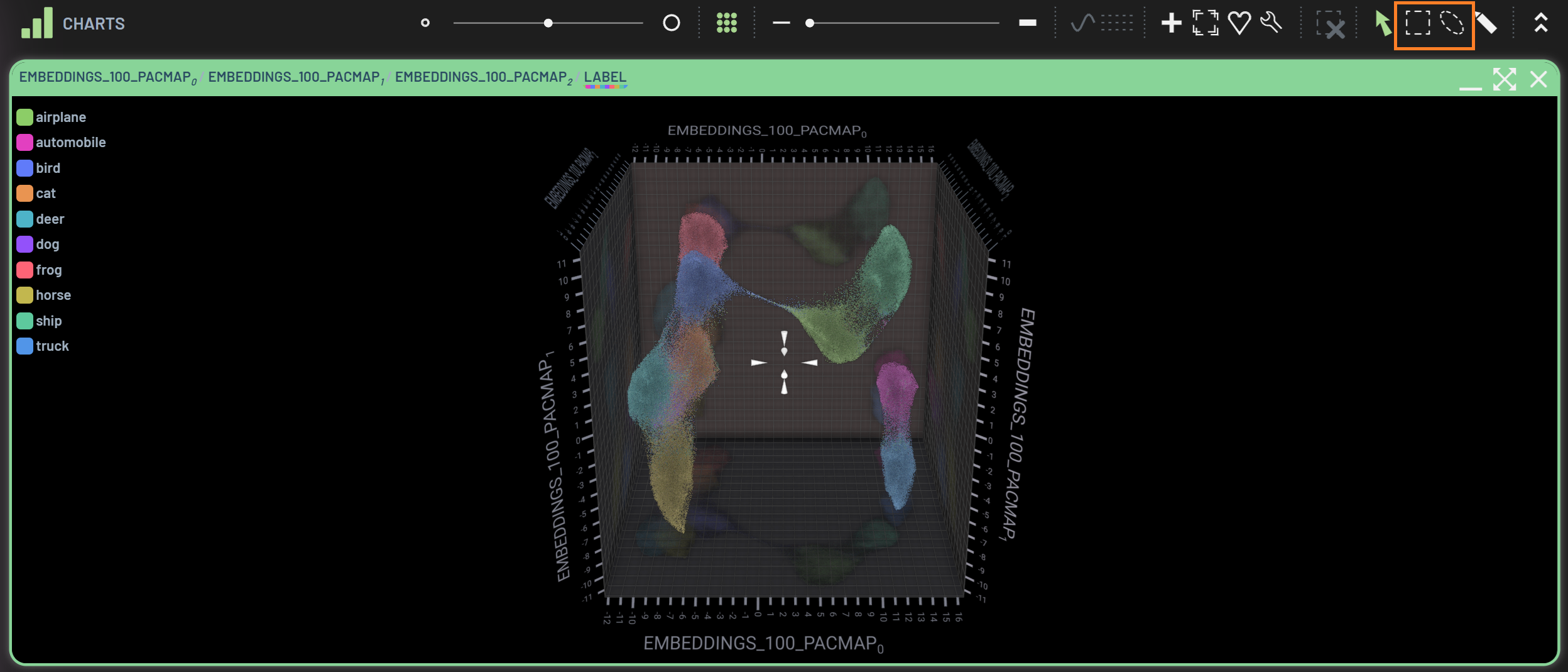
One 3-numeric column (e.g., a 3D-embeddings column) selected -> column_name0 / column_name1 / column_name2 scatter plot colored by a default metric (e.g., label)
Tweak Charts
There are many handy tools associated with charts. You can utilize these tools to adjust your chart’s appearance.
Charts Toolbar
The Charts Toolbar is located on the top of the Charts panel. The available tools may vary when different charts are selected.

The tools in the Toolbar above from left to right are (hover over the icons in Dashboard to see the tooltips):
Point size slider: Adjust scatter point sizes
Show/hide filtered-out points: Show or hide filtered-out points in grey
Line opacity slider: Adjust the opacity of the connecting lines of same sample across epochs; default 0
Show/hide filtered-out lines: Show or hide filtered-out lines in grey; grey out when line opacity=0
Smooth lines: Smooth the connecting lines to non-straight lines connecting two points; grey out when line opacity=0
Show partially filtered-in samples across epochs: when only partial data points of a sample are filtered in, click this icon to show the rest of the data points of this sample across all epochs. E.g., of 5 epochs, only Epochs 1 & 2 of a sample are originally filtered in by applying some filters and, after clicking this icon, all 5 epochs of this sample will show up.
Points: Plot as points (default for all scatter plots)
Boxes: Plot as boxes (used for confusion matrix plots)
Interpolate: Apply interpolation algorithms to the plot
Snap all to contents: Snap the chart to fit the chart window; Shortcut Y
Show legend: Display the legend on chart for the metric in the color dimension
Show custom chart annotation: Display a banner on top of the chart to show custom annotation
Favorite chart: Mark a chart as favorite chart, so that it will be automatically created next time
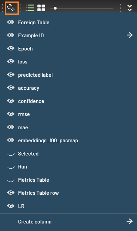
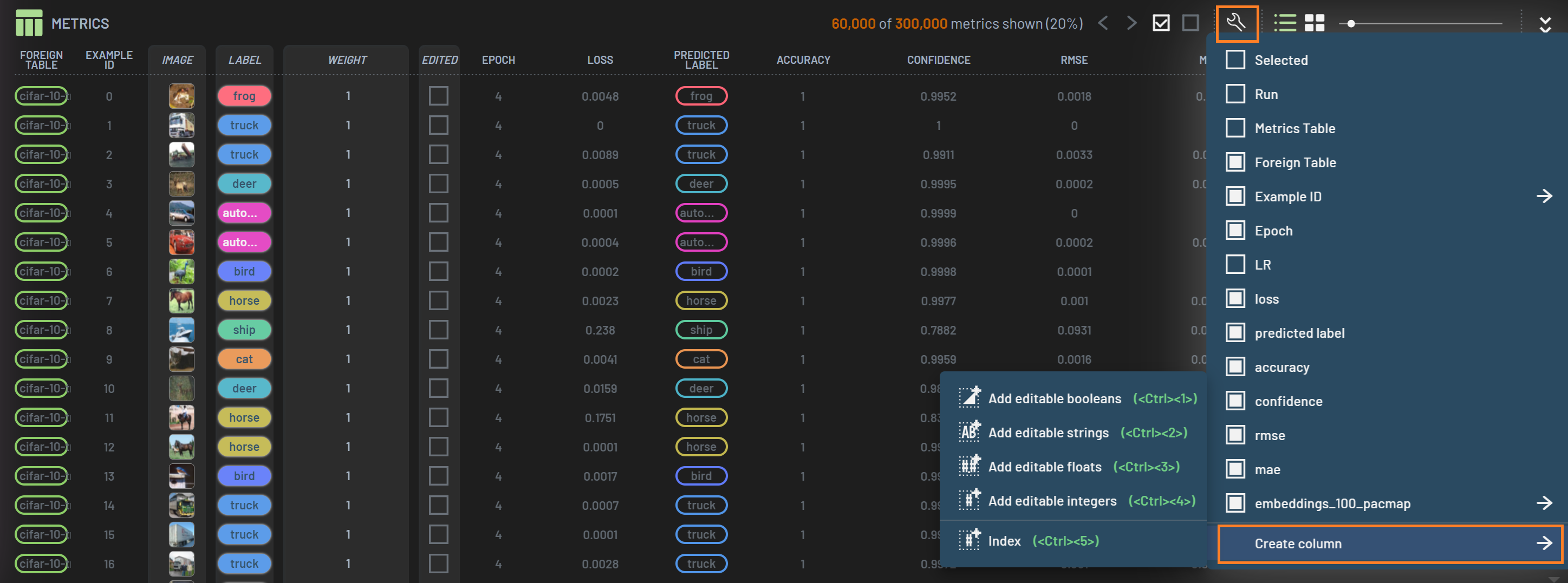
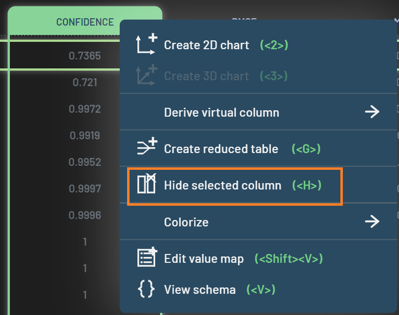
Tweak chart (wrench): Open a dialog with a full spectrum of chart tweaking functionalities
Lock chart contents: Freeze the content (e.g., data points) in the chart, so that other activities such as filtering will not affect this chart. When a chart is locked, a red lock icon will appear on the right of the chart’s title bar. Click it to unlock.
Clear all polygon selections: Clear all polygon (e.g., lasso) selections; grey out when no polygon selection applied; shortcut CTRL+G
Pan/rotate viewport: Pan 2D chart or rotate 3D chart; Shortcut Space or Q
Rectangle selection: Draw a rectangle on a chart to filter data points; shortcut W
Lasso selection:Draw a lasso on a chart to filter data points; shortcut E
Polygon selection:Draw a polygon on a chart to filter data points; shortcut R
Brush selection:Brush on a chart to filter data points; shortcut T
Paint bounding box: Draw new bounding box on ground truth BBs chart; shortcut U; only available for object detection datasets
Most of the tools are intuitive and easy to use, while others require a bit more explanation and will be detailed in subsequent tutorials. Below is an example of 3D embeddings charts with connecting lines and without connecting lines.
Tweak Chart dialog
After clicking the Tweak Chart wrench icon, a dialog shows up next to the selected chart. You can tweak many things in
this dialog. For example, a column selected in the radius column will be used to scale the radius of the data points
based on the column’s values. The example below shows larger data points with bigger losses in the 3D embeddings chart.
This additional column applied is reflected on the chart’s title bar.
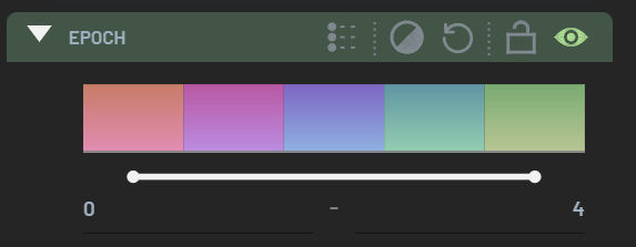
In the Epoch vs Loss chart below, the reducing (averaging) operation is applied on the Epoch and Label columns. Each point on the chart represents an average loss of a given label on a given epoch across the entire dataset.
You can also change an existing column (e.g., color column) in a chart to another column in the Tweak Chart dialog.
Overlay Properties
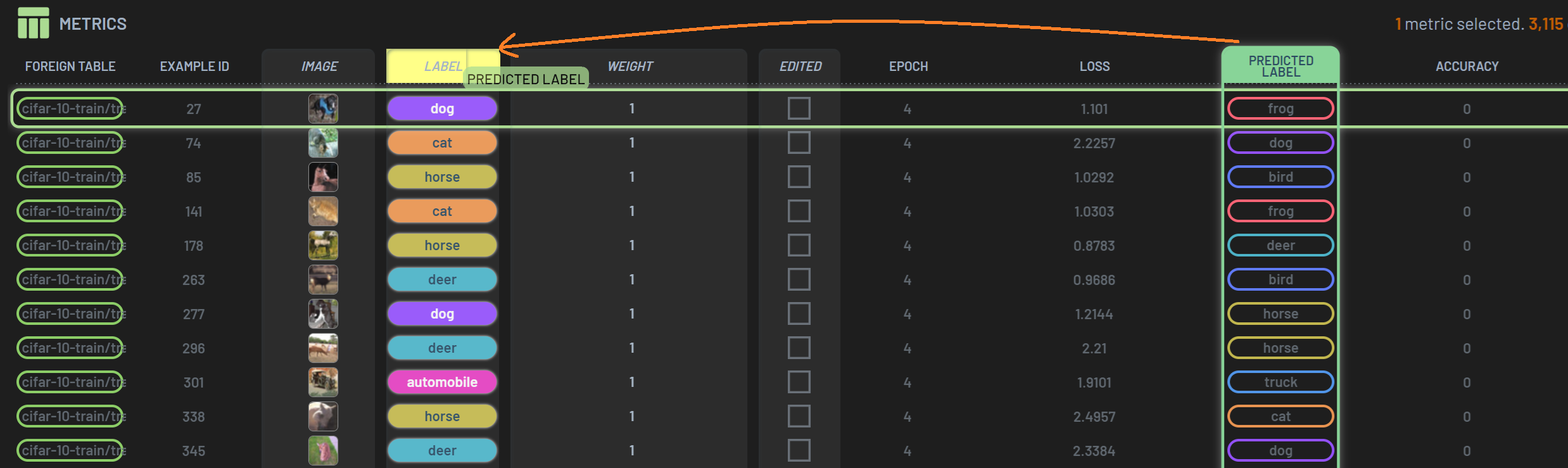
Charts can be overlaid by properties (i.e., columns). The overlay properties are displayed on the lower left corner of the chart. With the overlay properties, you can easily peek at what the currently selected sample is all about, e.g., the label and predicted label, etc.
To overlay properties, open the Tweak Chart dialog by clicking the wrench icon in the
Charts’ toolbar. The far right column is Show tweak overlay, where you can select the properties (columns) you want to
overlay on the chart.
An alternative way to overlay properties on an existing chart is to drag and drop the column into the chart as shown in the screenshot below. You can also reorder the existing overlay properties by dragging and dropping.
There is a simpler way to overlay properties on an image chart. You can simply select the image column and the columns you want to overlay on the chart before creating the chart.
The overlay properties can be edited in place, which is equivalent to editing them in the Rows panel.
Selection Tools
The polygon selection tools may be used to select and filter data points by drawing polygons on charts. They are located on the far right of the Charts toolbar and include rectangle selection and lasso selection.
For example, select the lasso selection tool then draw a lasso outline in the area of interest in a chart. The data points inside the lasso outline will be filtered in and the rest will be filtered out.
Draw another lasso outline to overwrite the previous selection.
To make multiple lasso selections, draw the first one as usual, and draw other ones while holding CTRL.
To de-select some filtered-in data points, draw a lasso outline while holding SHIFT.
To clear all polygon selections, click the
Clear all polygon selectionsicon on the Charts Toolbar or press CTRL+D.
The operations above apply to all polygon selection tools.
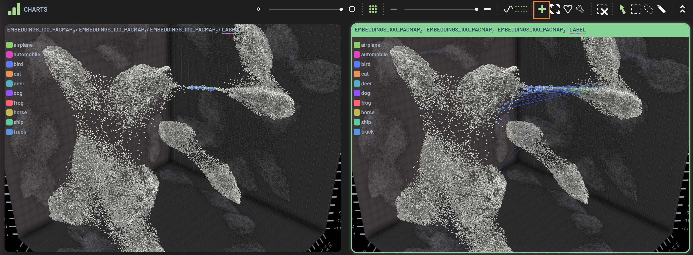
Partially filtered-in samples across epochs
Imagine a scenario where you filtered some data points of interest using the filters and/or polygon selections and then
you want to look at how these filtered-in samples evolve across all epochs. You can use the chart tool
show partially filtered-in samples across epochs in the Charts Toolbar to expand these
filtered-in samples to all epochs. Turning on the connecting lines enables you to see the evolving path for a given
sample (right chart). For comparison, the left chart only shows the filtered-in samples by lasso selection on Epoch 4
(filtered).
Warning
Unlike other operations, such as switching to polygon selection, this operation applies only to the selected chart. It is also a visual-only enhancement limited to that specific chart that does not change the global filter state, which means those data points are not reflected in the Metrics panel or in other charts, and you cannot do further data manipulation (e.g. filtering) on those additional data points.